Fans point out that the Street Fighter 6 logo looks like a $80 clipart from Adobe
Apparently gamers and fans are having none of Capcom and their perceived “lazy” design work for the Street Fighter 6 logo.
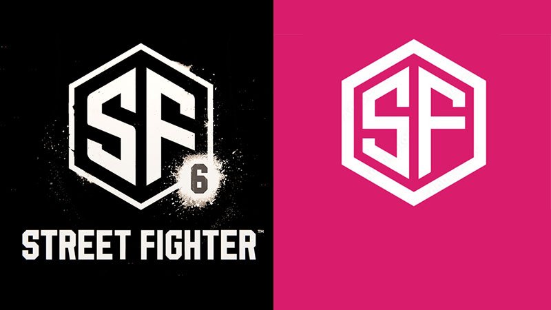
You can see above the logo that Capcom released for the sixth installment of the popular fighting game. The logo came out together with the Street Fighter 6 teaser which was released at the end of the Capcom Pro Tour or CPT.
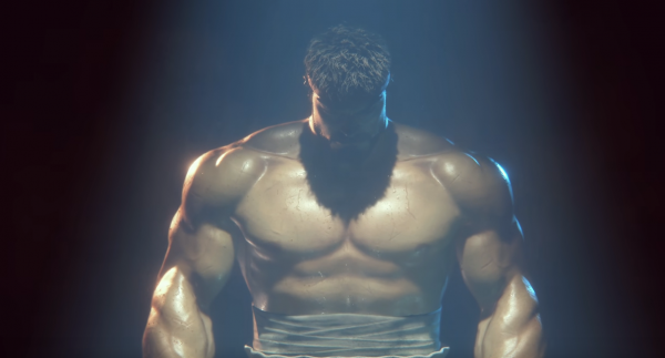
The teaser featured a bearded Ryu going up against Luke, one of the newest fighters introduced as a DLC character in Street Fighter 5.
Fans pointed out that the new logo looked very much like a $80 clipart you can buy from Adobe whether its going to be for Adobe Photoshop or other Adobe products. Check out a screenshot of the clipart below…
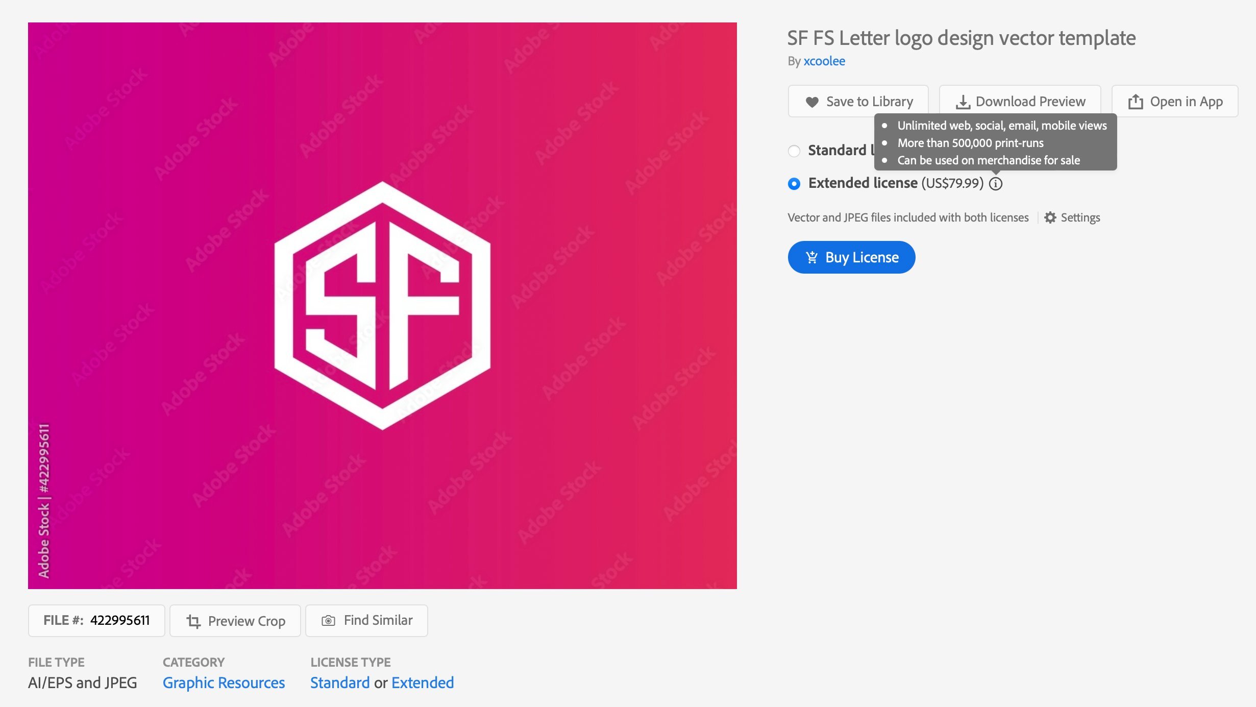
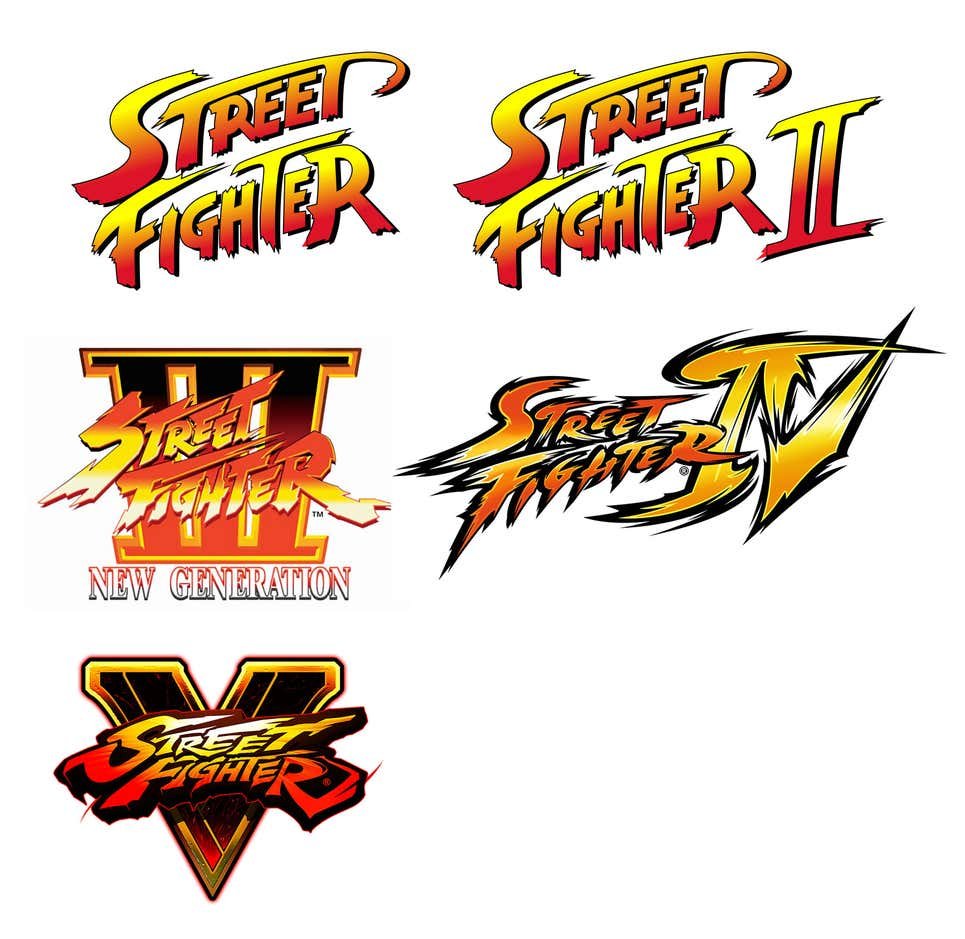
And you have to admit it does look uninspired to say the least. Just check out the previous logo designs used for the past main Street Fighter game.
But what do you think?
Personally I think Capcom still has a lot of wiggle room and course correction as the only thing we have right now is the teaser video. Hope they actually do listen to fans too and make the save for the logo.
Follow me on Twitter at @thefanboyseo


